Learn the strength of hue! Our ultimate guide to Color Theory & Psychology shows you how to create amazing, powerful palettes that will captivate your viewers and boost conversions.
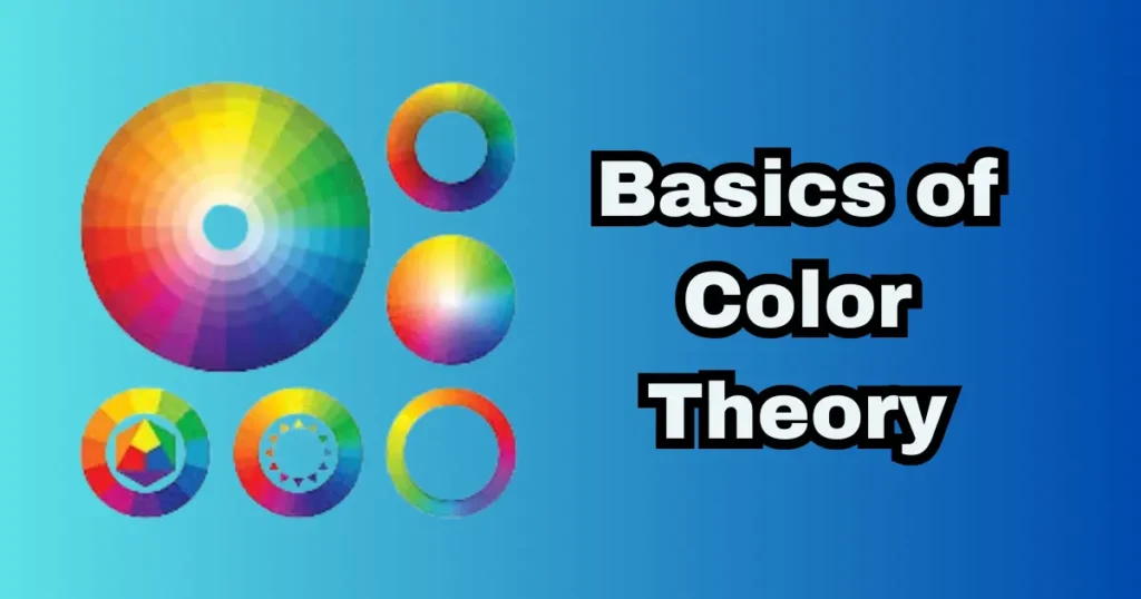
What are the Basics of Color Theory
Learning the basics of color theory is like opening a hidden language for your artistic endeavors. Fundamentally, this field offers a sensible system for understanding how colors interact, utilizing a tool most likely familiar from art class: the color wheel. The first step toward producing aesthetically appealing and emotionally evocative work is mastering these fundamentals, which directly access the strong ideas of color theory and psychology. It’s about how color affects perception and emotions as much as it is about what looks good.
How Do Complementary Colors Work
Using complementary colors is among the most vibrant ideas. These combinations, like red and green or blue and orange, found straight across from each other on the color wheel, produce the greatest contrast and high energy. This dynamic contrast makes every hue seem more vivid and is ideal for highlighting important features in a design, a deliberate use of color theory & psychology to capture the viewer’s attention.
What is the Difference Between Analogous and Triadic Colors
Other systems highlight harmony, whereas complementary colors stress contrast. An analogous color palette produces calm and comfortable designs by combining hues adjacent on the wheel. A triad color palette uses three colors equally distributed around the wheel to create a rich and vivid look without the jarring contrast of complements, hence providing more visual appeal while preserving balance. At the opposite end of the spectrum, a monochromatic color palette looks at the depth and range of one color. It makes a classy and unified feel by using tonal color harmony.
What is the 60-30-10 Color Rule?e
The 60-30-10 rule is a classic decorator’s secret for a balanced color palette and a useful tool for using these ideas. According to this formula, a space (or design) should have 60% as its main color, 30% as its second color, and 10% as an accent color. This ratio guarantees your selected color harmony seems deliberate and polished and prevents any one hue from overpowering the eye, therefore producing a sense of visual balance.
How Do Warm and Cool Colors Affect Design
Design of color temperature ultimately depends on the idea of warm against cool colors. Red, orange, and yellow are warm colors that move towards the viewer and are sometimes used to create excitement or warmth. Calm and receding, cool hues—blues, greens, purples—help to establish tranquility and space. Understanding temperature is an absolutely necessary part of color theory and psychology since it lets you decide on the whole tone of your work before even one word is read.
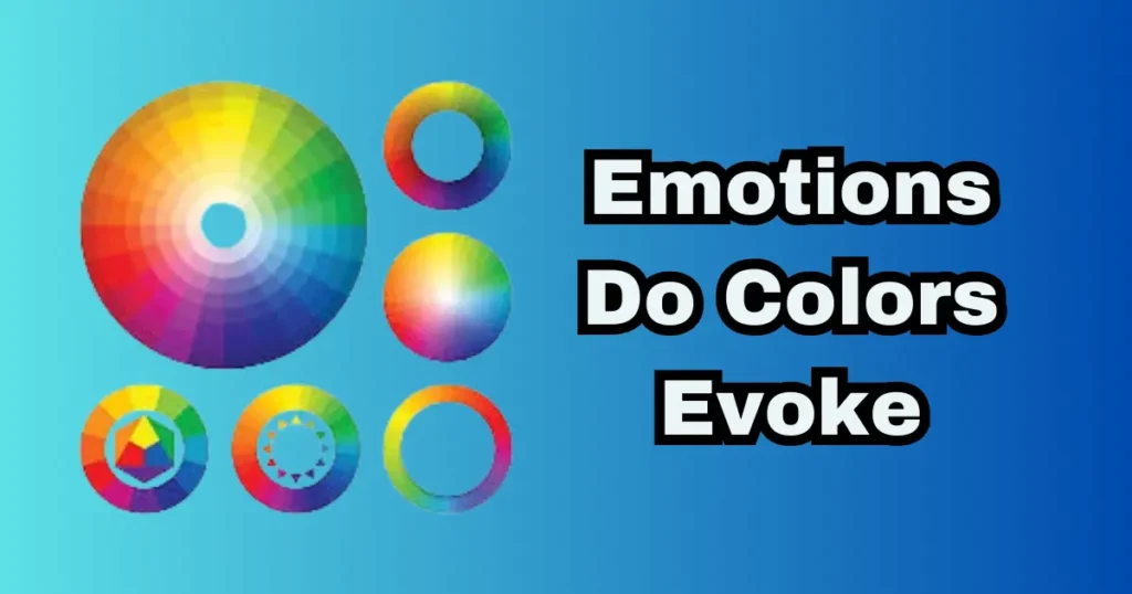
What Emotions Do Colors Evoke
Beyond simple combinations, we delve into the interesting world of color theory and psychology, which investigates our strong emotional ties to certain colors. What is color psychology all about? Simply said, it’s the investigation of how various hues affect our actions and views. Red can inspire excitement or urgency; blue typically inspires trust and calm. The psychology of colours reveals this. Any designer or marketer will find great benefit in knowing these emotional signals; they help to close the distance between a basic palette and deliberate communication.
How Does Color Psychology Influence Branding
This information is crucial in the field of branding. A company’s brand colors are carefully chosen using the psychology of color; they are not selected by chance. Consider a bright, lively orange versus a sleek, elegant black. Before a consumer ever sees a slogan, the colors chosen reflect a brand’s fundamental character and values. A basic tenet of color theory and psychology, this strategic alignment guarantees that the target market’s unconscious level resonates with a brand’s graphic identity.
Which Colors Attract Customers the Most
Though there isn’t one ideal color, some shades are more successful at capturing attention. For its excitement and sense of urgency, red is sometimes used in Buy Now buttons. Still, the most appealing hue mostly relies on the situation and the intended use. Whether you say color or colour, the psychological effect stays the same. The psychology of colours in marketing shows that knowing your demographic and sector is crucial to choosing the most captivating shades.
How Does Color Affect User Experience and Behavior
Color’s impact is extensive in user experience (UX). While a well-contrasted color scheme can cause annoyance and site abandonment, a simple, blue-based interface might feel more reliable and keep consumers on the site longer. In color theory and psychology, where careful color theory choices direct the user’s journey and enhance general pleasure, this direct link between hue and action is quite important.
What Colors Are Best for Marketing
Those that fit your brand’s message and elicit the intended mood define the greatest marketing colors. While eco-brands nearly always use green, reliable sectors like finance and tech usually depend on blue. The trick is to consistently use the meanings connected to every color. Understanding color psychology can help you make wise decisions that not only look good but also boost conversions and involvement, therefore increasing the efficiency and honesty of your marketing campaign.
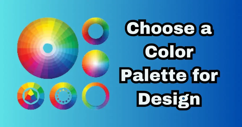
How Do I Choose a Color Palette for Design
Choosing the ideal color scheme might seem intimidating, but with the application of color theory and psychology, it becomes automatic. The aim is to go beyond individual taste and develop a strategy that clearly conveys your message. Start by identifying the feeling you want to inspire, whether you are developing a reliable brand color palette or creating peaceful visual color palettes for a website. Color theory and psychology give you a strategic base here so that your decisions are both lovely and useful. Based on tested ideas, your search for the ideal hue inspiration for designers starts here.
What is the Best Color Palette Generator
Although a thorough knowledge of color psychology and theory is crucial, online tools may spark your imagination. Your requirements will most likely influence the greatest color scheme generator. While some programs are great at creating accessible schemes from a single starting color, others shine at pulling palettes from images. Use these generators as a launchpad, but always refine the ideas with your color theory and psychology knowledge to make sure the palette is unified and conveys the right mood.
How Do I Create an Accessible Color Palette
If it is not useful, a lovely palette serves no purpose. Modern design absolutely requires the creation of accessible color palettes to guarantee your material is readable for everyone. This is about making sure color isn’t the only means by which knowledge is communicated, not just about basic contrast checks. Including accessibility from the beginning is a vital, people-centered use of color psychology and theory that will make your work inclusive and successful.
What Are the Trending Color Palettes for 2025
Looking ahead to 2025 color palette trends, we observe a turn toward calming, natural tones. Reflecting a need for tranquilly and genuineness, rich earth tone color palettes will be seen alongside subdued pastel color palette choices. Trends are a fantastic source of color inspiration for designers, but they have to be viewed through the lens of your brand’s own personality and the classic ideas of color theory and psychology.
How Do Designers Use the Color Wheel to Create Palettes
The designer’s main instrument for creating harmony is the color wheel. The wheel offers the path, whether you are creating a peaceful vintage color palette with related colors or a bright triadic design. It eliminates the uncertainty from mixing, so you may confidently produce well-balanced, vibrant palettes. The fundamental ideas of color theory and psychology are physically used in this functional application of the wheel to turn theoretical concepts into a visual reality.
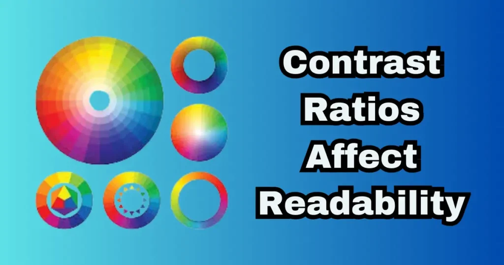
How Do Contrast Ratios Affect Readability
Beyond selecting lovely hues, a fundamental tenet of color theory and psychology is making sure your writing is really readable. This is where knowing color contrast ratios is absolutely essential. Dark charcoal lettering against a light cream backdrop produces clear, simple-to-read text with a strong contrast ratio. A low ratio, such as light grey on white, strains the eyes and separates consumers. In web design, this specialized component is quite important since it directly influences accessibility and user experience. It’s the ideal illustration of how psychological and color theory have to find a compromise between creative expression and practical demand.
How Do I Build a Color Palette for a Website
Creating a website palette is a deliberate approach whereby designers use color theory in the digital realm. Begin with a base neutral, then select a main brand color that captures your intended feeling. From there, use design methods like the 60-30-10 rule to properly distribute these colors: 60% for your neutrals or background, 30% for your main color, and 10% for a vivid accent. This organized method, based on color theory and psychology, establishes a visual hierarchy.
What Are Color Grading Techniques in Design
Consider color grading as the last finishing touch that brings a visual identity together. Taken from film, this technique involves tweaking hues, saturation, and tones throughout a design to create a particular mood or environment. Whether you’re going for a warm, nostalgic vibe or a sleek, futuristic look, knowing these methods lets you tell strong, cohesive stories. Good design is raised to great design by this subtle ability to control mood, which is an advanced use of color theory and psychology.
How Does Color Temperature Impact Visuals
A basic lever in visual communication is colour temperature, the spectrum from cool (blues, greens) to warm (reds, oranges). Cool colors are ideal for backgrounds; warm hues seem lively and forward-moving, sometimes used to emphasize calls-to-action. For those working with color theory for painters or designers, changing the temperature is very important because it helps to make things look deeper, more focused, and to create a particular mood. That’s why it’s one of the most important things to do in color theory and psychology.
What Color Palettes Work Best for Branding
Simple, memorable, and closely consistent with the fundamental principles of the company are the most successful branding palettes. Here is where a thorough grasp of color theory and psychology really pays off. While an organic food brand might go with warm browns and greens to convey natural quality, a tech company might use a hip blue to show trust. Brands may create a closer, more real relationship by carefully choosing a small palette that appeals to their intended customers on a psychological level.
Weaving Color Theory, Psychology, and Palette Creation Together
As we have learned, the trip from the color wheel to a finished product is where science touches passion. A great visual is distinguished from a strong one by an understanding of the basics of color theory and psychology. It distinguishes between just choosing colors you like and deliberately choosing colors that represent the narrative of your company, affect user behavior, and establish a strong relationship with your target.
Effective design revolves around this synthesis of psychological understanding and technical expertise. Your greatest competitive edge is finally a thorough knowledge of color theory and psychology. It turns your design process from conjecture into a deliberate plan, enabling you to create a consistent and distinctive brand identity that really stands out. You’re conveying ideals and motivating involvement on a subconscious level, not only improving aesthetics.
Ready to test this in real life? To have these ideas at hand for your upcoming project, download our free Color Palette Cheat Sheet. Even further, go on to our next post on advanced typography pairing to totally match the visual tone of your brand.
Related Topic:
- Best IMAGE & DESIGN Platform 2025
- Adobe Firefly in 2025: The Ultimate AI Art Tool for Designers
- Midjourney in 2025: A Guide to AI Art Generation
- 5 Best AI Image Generator Tools in 2025
- The Best AI Clothes Remover Tools Complete Ethical Guide (2025)
- BEST AI TOOLS IN 2025
- RELATED TOPICS ABOUT IMAGE & DESIGN
- BEST BLOGS ON AI TOOLS
- ABOUT US SMARTTOOLBLOG
- CONTACT US SMARTTOOLBLOG
FAQs: Demystifying Color Theory & Psychology
What is Color Theory & Psychology, and why is it important?
Combining the study of how hues affect human psychology and conduct with how they appear visually (using tools like the color wheel), color theory and psychology examines their interaction and significance. It is the basis for producing strategic designs as well as ones that are pleasing to the eye. For designers, it connects a gorgeous color harmony with a palette that really connects with people.
How does Color Theory & Psychology influence human emotions?
This is the foundation of color psychology. Various colors elicit underlying reactions; red can energize, blue can soothe, yellow can uplift. Knowing Color Theory & Psychology is therefore so strong as it lets you purposefully create a particular mood or feeling in your work by this link between color meaning and emotion.
How is Color Theory & Psychology used in marketing and branding?
It’s the key ingredient behind a good brand color scheme. According to the psychology of color in marketing, the hues of a brand are a non-verbal means of communication rather than only for decoration. Under Color Theory & Psychology, this deliberate application of color symbolism in branding enables businesses to increase awareness, communicate values, and engage with their ideal clientele on a more personal level.
What are the psychological meanings of primary colors?
Basic colors have fundamental significance. Red usually denotes enthusiasm and vitality; blue represents trust and stability; yellow elicits warmth, clickable buttons, and Psychology are founded on these fundamental relationships, which subsequently develop into more sophisticated systems like complementary colors for contrast or an analogous color scheme for harmony.
How does color psychology apply to web design and UI/UX?
Color guides user behavior and guarantees clarity in web design’s color theory. It helps design buttons that are clickable and ensure text is easily read by providing enough contrast in available color palettes; it also helps build visual hierarchy. Creating simple, efficient, and emotionally interesting digital experiences depends on using Color Theory & Psychology here.